Totally Swift!
Designed a platform that helps users successfully navigate high-demand concert ticketing, combining user research and behavioral insights to help new fans anticipate demand, act faster, and secure tickets with confidence.
Case Study Overview
UX Designer & Researcher
Product Design, User Research, Web Design, Mobile Web Applications, UX/UI
Duration:
Apr 2025 – Jul 2025
Problem
What I noticed: With unprecedented demand to see Taylor Swift perform live, it was extremely hard for first-time and seasoned concert-goers alike to get tickets to her latest and greatest, The Eras Tour.
Goal
What can I do? Help new Swifties and interested individuals attend the Eras Tour by providing resources to advance them through the ticketing process.
My tasks:
- Conduct user research
- Define the problem and provided insights to inform the ideation phase
- Define personas, user journeys, empathy maps and user flows
- Visual design of low-fi and high-fi wireframes, prototypes, and user testing
Understanding the user
User Research
I began with remote interviews to gather information about user needs, problems, and experiences.
Participant overview:
- Haven’t bought tickets for a concert before OR
- Not familiar with the ticket process OR
- Interested in attending a concert
- [Optional] a fan of Taylor Swift
Pain points
- Unfamiliarity - Participants are held up when trying to navigate the site or being ill-prepared on ticket release day.
- Unreliable seat status - Some users received a sudden notice their selected seats were unavailable during checkout.
- Limited options - Large group buyers can't exceed the ticket limit per transaction, restricting party sizes.
- Reservation difficulties - Large group buyers have difficulty finding seats to accommodate the entire group in one area.
Persona
.png)
User Journey Map
.png)
Starting the design
Sitemap
.png)
Paper wireframes
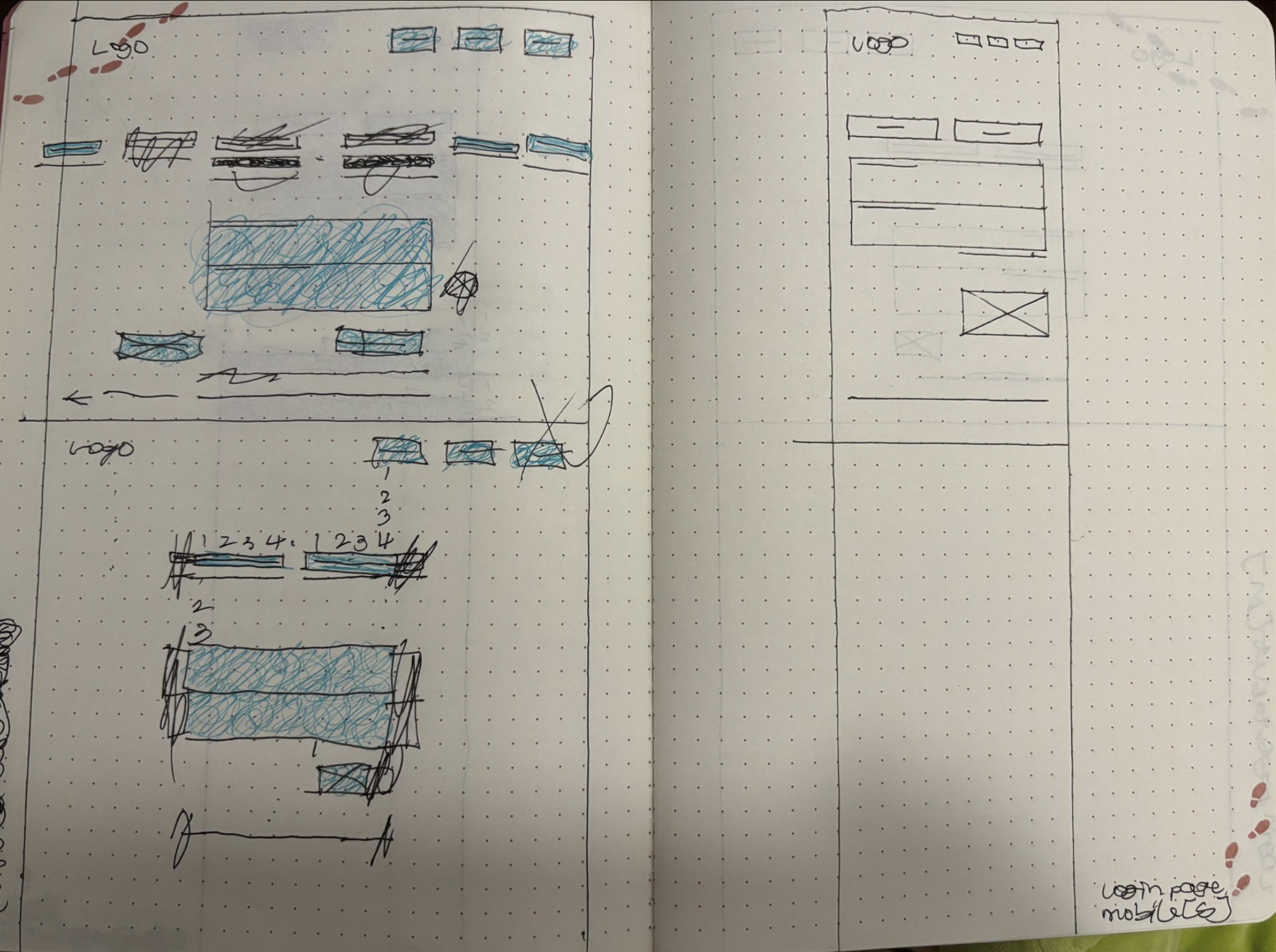
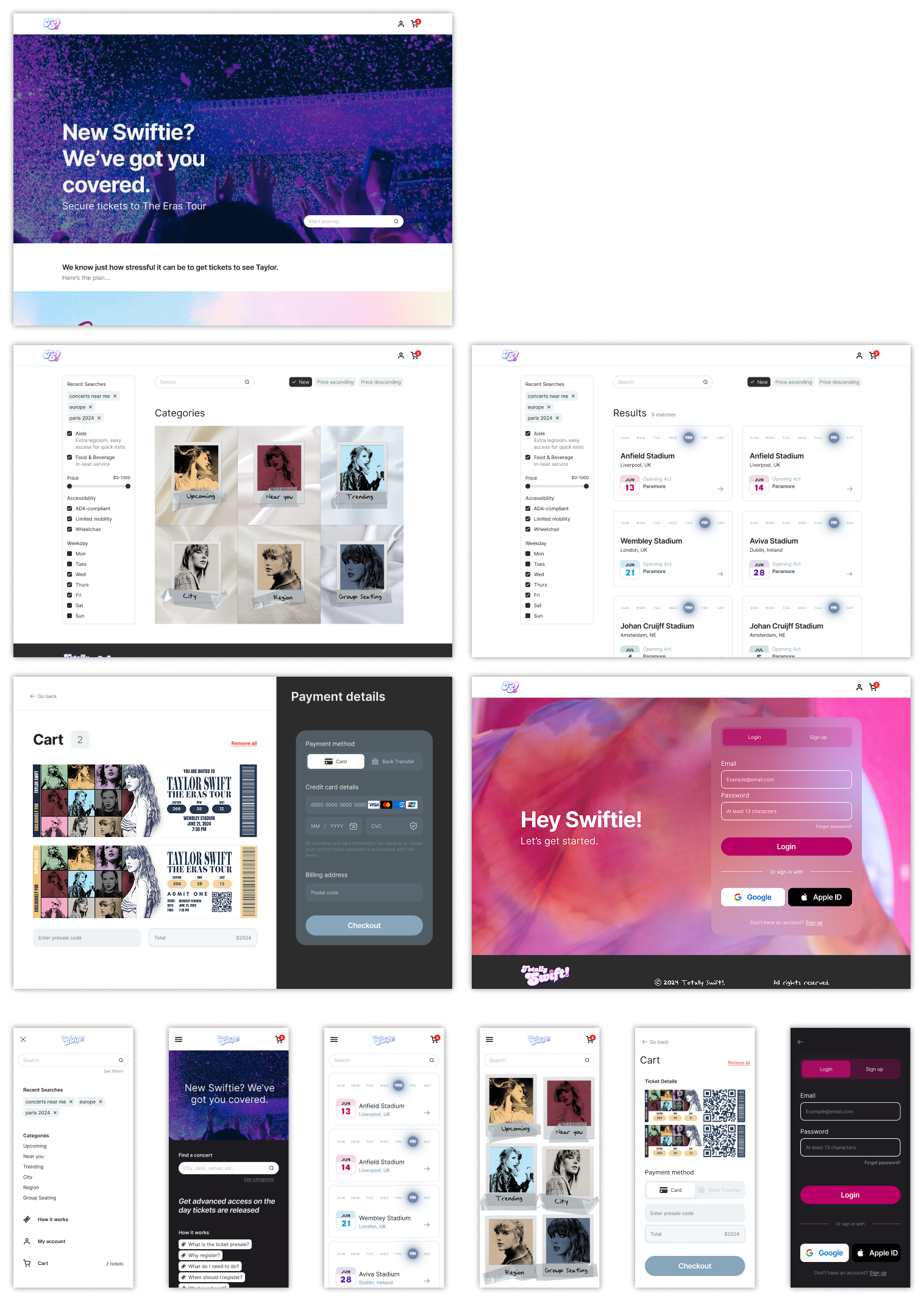
Digital wireframes
SCREEN SIZE VARIATIONS
Usability Study
METHODOLOGY
Remote, moderated, conducted over 2 days.
Participants are asked to complete tasks by the moderator in one-on-one sessions. Each participant then completes a questionnaire on their experience privately.
Length: Each session is 45 minutes long, consisting of the introduction, task list, and questionnaire.
Compensation: $10 value gift voucher for use at Taylor Swift’s online merch store.
Participants: 2 male, 2 female, 1 non-binary, all aged 18–75 years old. 1 of which is a user of assistive technologies (keyboard, screen reader).
STUDY FINDINGS
Help tools
- Resources section: users wanted more support to better assist them through registration
- What can remedy this? general presale information, tasks for each step of registration
Filters
- Search results list view: users tried to look by city/price/day of the week, but had no filtering
- What is missing? filter capability
Navigation
- Users mainly interacted with icons at the top of the screen vs. the navigation bar
- What is the issue? functionality is possibly redundant
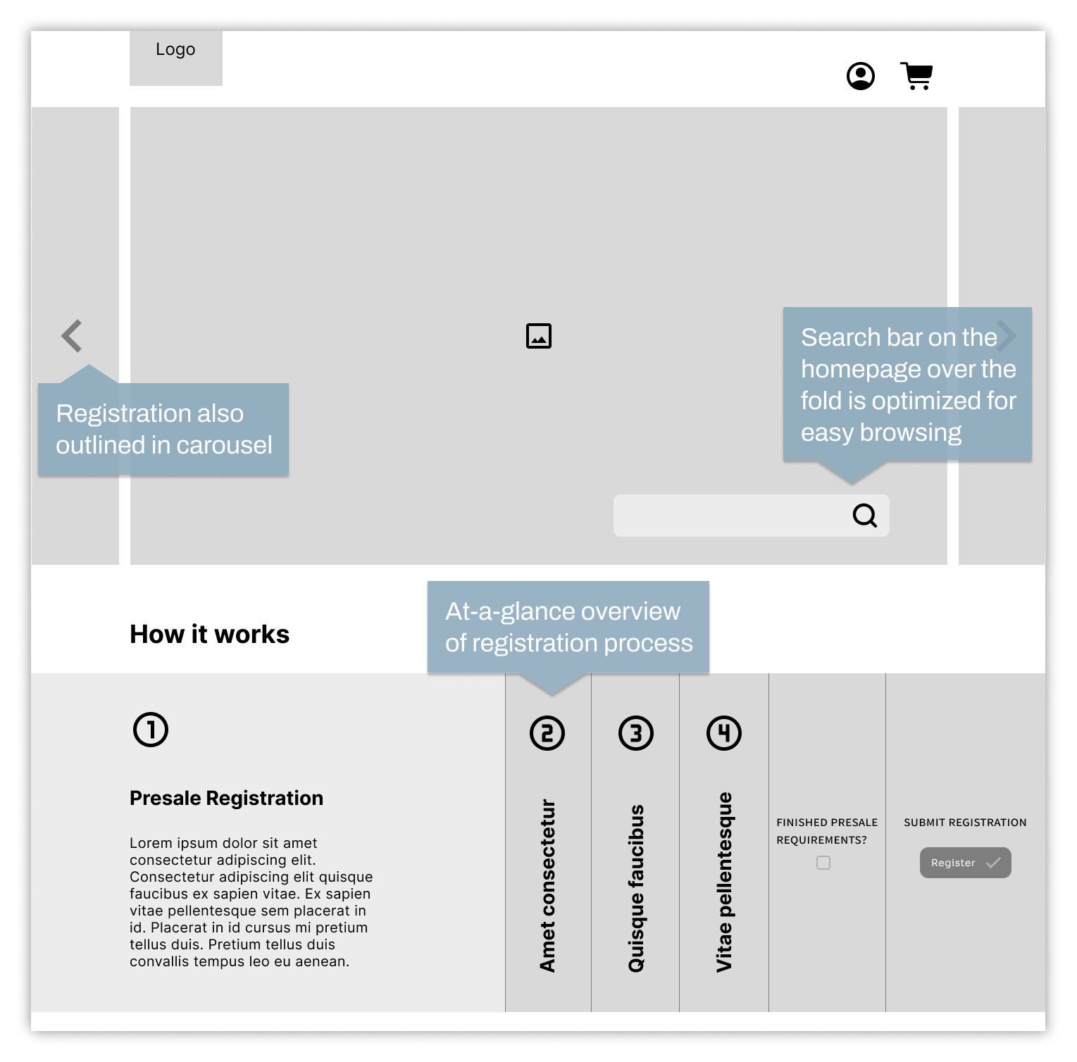
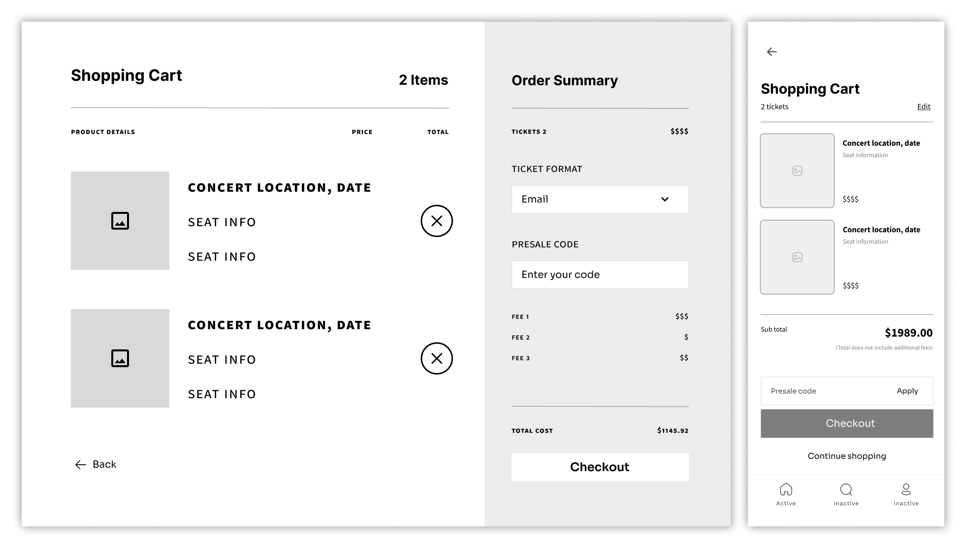
Refining the design
Mockups
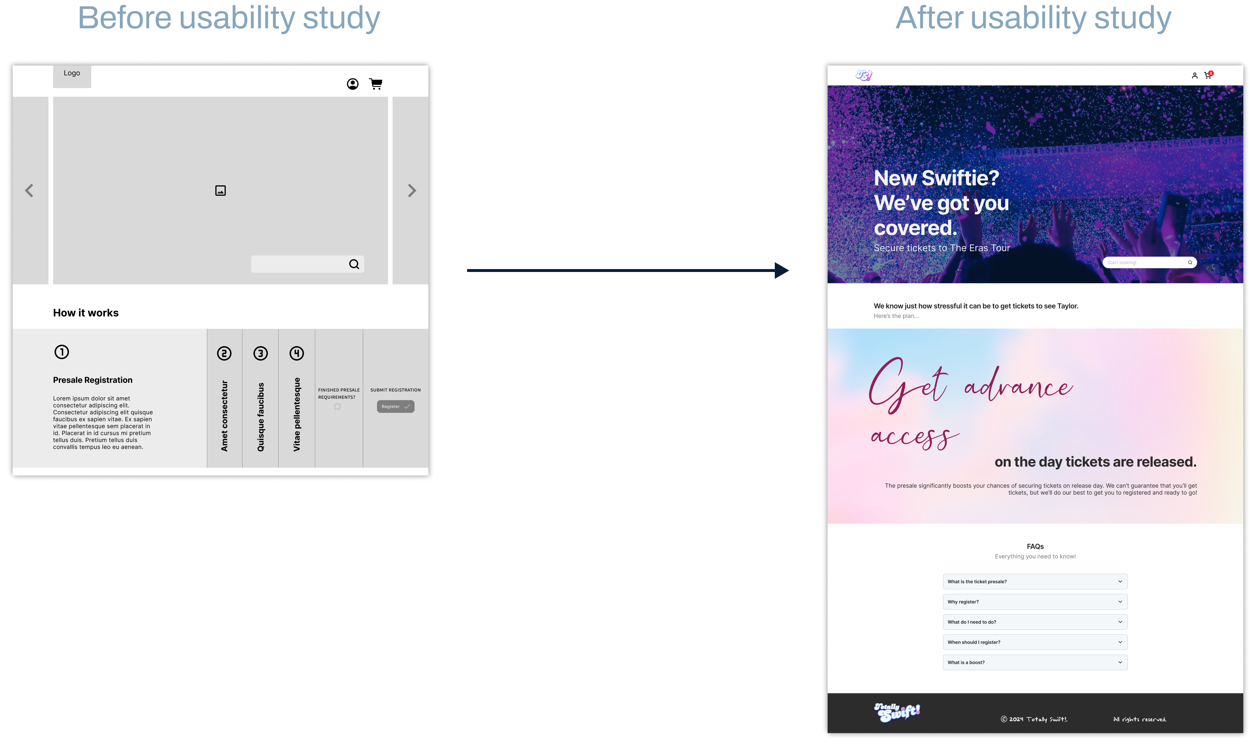
Accessibility Considerations
✓ Color palette
When choosing a color palette, I made sure my primary colors met WCAG AA Compliance before building the UI for each screen.
✓ Cohesive font
I used the typeface Inter for both headlines and body copy; it's an easily readable sans serif font. Too many different typefaces can make the content disjointed.
✓ Text hierarchy
Users can distinguish the different sections. It also ensures a logical keyboard navigation sequence for those using assistive technologies.
Going Forward
Impact
In an effort to improve the holistic experience of attending a live performance, I created a platform to help fans get tickets. To improve specifically the ticket purchase experience, I needed to figure out how to best guide the user through an information-heavy task.
I accomplished this by seeking out participants, getting to know the user, and seeing how they interacted with my design.
What I learned
As a UX designer reimagining a ticketing platform, I gained valuable insights and practical knowledge through the design process. Key takeaways include:
- Understanding user needs
- Importance of simplicity
- Accessibility considerations
- User feedback
Next Steps
- Receive feedback from designers with more experience in the field to improve design.
- Use feedback to make design changes that improve overall experience.
- Create a cross-platform responsive design. The goal is to build the same experience for all users, regardless of the device they use.